

Orange Crush

Lately I’ve been using a satin orange glaze on quite a few of my pieces; I love a waxy punch of color. This isn’t a new occurrence, as I’ve always been drawn to the color in the studio (clementines in a video work, a sumptuous swath of orange velvet, a plastic orange basket, rusty orange linoleum tiles). Rebecca Morris mentioned in an artist talk that she had been trying to make the ultimate red painting and I got to thinking about how I’m always striving to create the ultimate orange sculpture. Clementine Stack, pictured below, is one version of My Ultimate Orange and it combines a lot of treasured memories, as well as the primal impulse to stack things.

Clementines, tangerines, navel oranges, and all their siblings already exist in the world as perfect objects. I treasure every wedge of citrus abundance I encounter. Sculpting them comes from an urge to spend more time with their humble beauty.
Favorite Orange Moments

Milton Avery understands the thingness of a color and never misses with his color combinations. The washy, rusty orange in this piece almost feels like a neutral and might even be a brown, judging by other photos of the painting online. But it feels like the exact color of a wet orange towel. Heavy and grounded.

I would love to see a two-person exhibition of Milton Avery and Alice Mackler. They even have mirror initials! Mackler’s lumpen ceramic ladies embrace clay’s spontaneity and her glaze application reminds me of the freedom found in finger painting. She tends to favor a Cheeto orange. Her orange is aspirational and playful, a bit performative.

Joan Mitchell paints ecstatic messes. I stumbled across this piece recently at the Denver Art Museum and spent a long while taking it in. I think what excites me about it is the gravity of the colors, with the brighter hues bunched towards the bottom as if they are sliding down the painting. Her orange is waxy and visceral, like a flayed orange peel. The swampy green is a perfect companion.

Amy Sillman also pairs a punchy orange with olive green. Taking center stage, Sillman’s orange reads simultaneously as pure light and as large mass. It anchors together all the smaller smears and scribbles of color. A magnificent view!
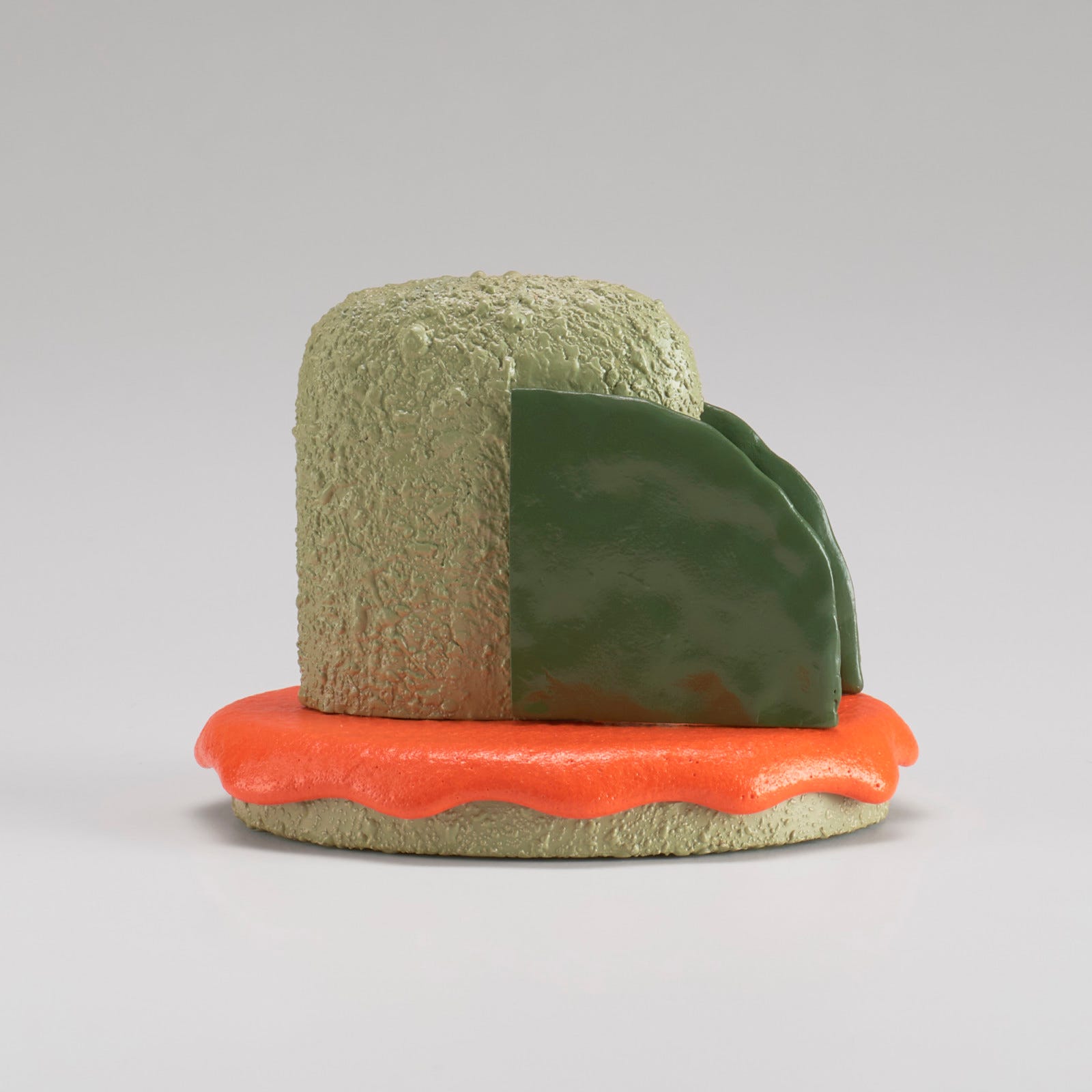
Ron Nagle seems to gather all the materials of the world and melt them into curious material composites. His art is inexplicably…appetizing. This orange looks like a melted traffic cone defeated by the summer heat. Again, we see it paired with olive green and a crunchy pistachio hue. Something about that pairing just works!

The particular faded oranges in this woodblock print by Kubo Shunman evoke nostalgia for summer, leaving the house with a pocket full of fruit and no plan. Timeworn orange hues top my list of favorites, but it can be hard to achieve in ceramics without muddying up the color. Send me your tips if you have any!

Gulsah Mursaloglu understands that orange is a color of motion. She uses real oranges in some of her works, which become characters in an ersatz ballet of life’s various material encounters. I saw her work for the first and only time back when I lived in New York and I probably think about it on a weekly basis. She truly embraces the descriptor “dimensions variable.”

Leave it to William T. Wiley to throw the ultimate orange curve ball. Pictorially, this is just a weird piece. Everything and nothing is the focus. The orange orb exists in that electrifying place where it is almost red. It’s as if the ball is a center of gravity, luring in all the other drawn elements. I’ve got a whole post about Wiley here if you’d like to learn more about him!
I really enjoyed searching for perfect oranges throughout art history and it’s a color that will always ring my bell. Let me know about your favorite orange art history moments!
Until next time,
Paloma :-)